
Complex systems,made to feel {{ rotWord }}
I'm Sean, a product designer with 14+ years of experience across games and digital products. My work brings together product thinking, interaction design, and visual craft.Learn more about me→
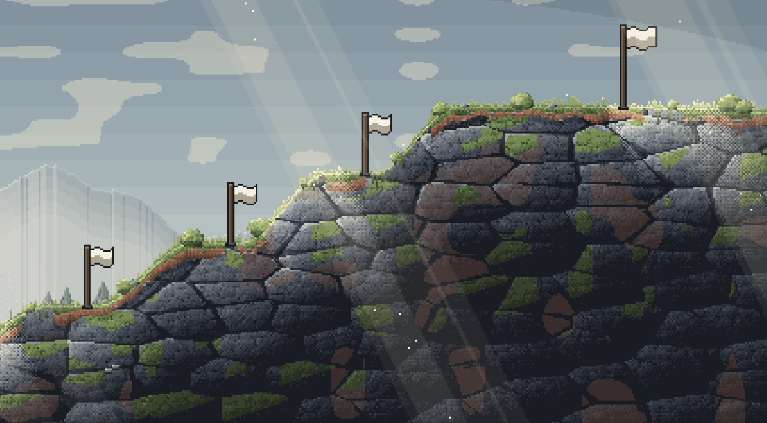
The goal isn’t to make job searching a game. It’s to make the effort behind it feel recognized.
The Problem
Job seekers control the applications, the interview prep and the follow-ups. They don’t control whether anyone replies. Over a long search, that gap wears people down.
A better way to find jobs
The first version assumed people needed help finding jobs. It offered job discovery, daily recommendations, application tracking and a light layer of gamification.
Untested assumption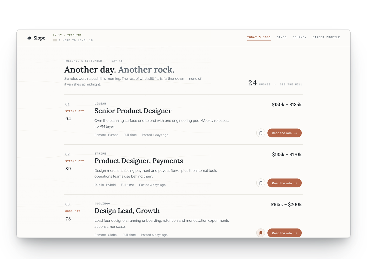
Research & Discovery
I showed the early Slope to potential users and talked with them informally: first impressions, how they already search, and how they reacted to each concept. These were open conversations, not a formal usability study.
At first glance, Slope looked like another job search product.
No one asked for another set of recommendations.
Pushing a rock uphill got people talking about what their search actually felt like.
They weren’t interested in another job recommendation tool. They were interested in the experience of pushing forward.
The Pivot
If people already had ways to find jobs, Slope didn’t need to be another job board. I moved the focus to what happens after someone applies, and used application tracking, the journey and game mechanics to make that effort visible.
Drop job discovery as the core
Stop trying to replace the way people already search.
Put the rock at the center
Turn a fun visual reward into the metaphor for progress across the whole product.
Focus on what happens after applying
Tracking, waiting, rejection, and staying steady through a long search.
Designing Around Existing Habits
People already had job sites they liked using. So instead of asking them to change how they search, Slope fits around it. That gave the product two places to live.
Logging is quick, updating is quicker
Add a job you’ve already sent with just a company and role. The stage and job link are optional. Stage is a single tap on the row, and the active list puts the furthest-along application first.
The tracking is plain and practical. The game sits on top, so it never gets between you and your applications.
Track jobs right next to the job site
Applying happens on LinkedIn, Greenhouse and company career pages. A side panel stays open next to those sites, so you can log or update an application without switching to another tab.
With limited space, it shows only what you need right then: new applications picked up from your inbox, the ones that need a quick review, and your active list. Everything else lives in the full Slope app.
Meet users where they already are
Two places, one rock. The side panel handles the quick stuff while you’re applying. The full app is where you step back and look at the whole search.
Turning Effort into a Journey
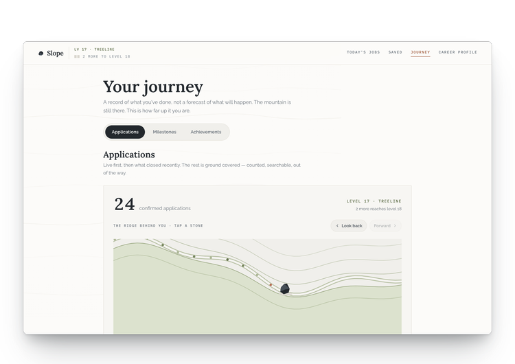
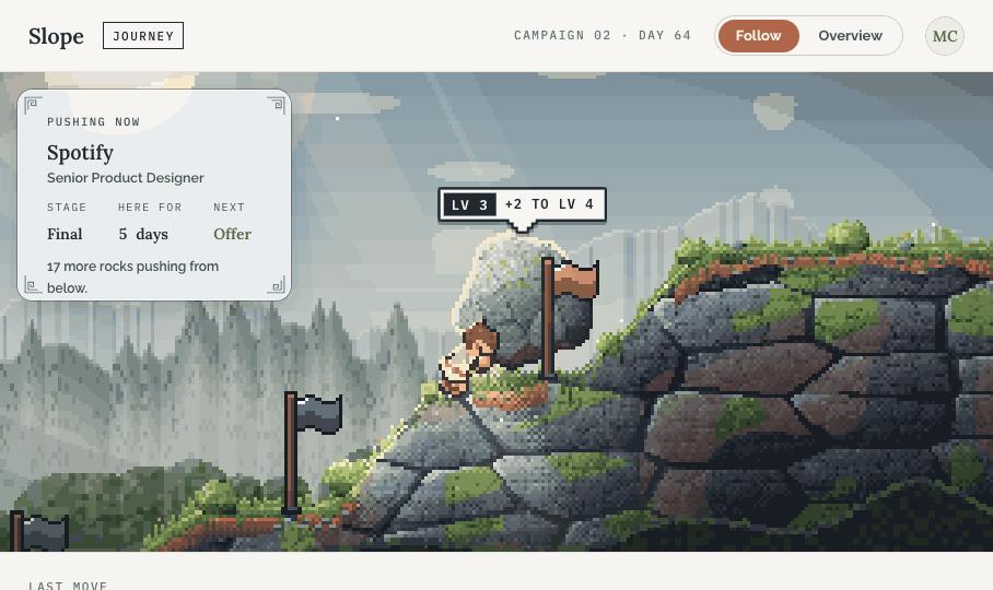
Slope turns everyday effort into a journey worth recognizing. Each application you send becomes a push up the mountain. The rock is your search, and it moves only when you do.
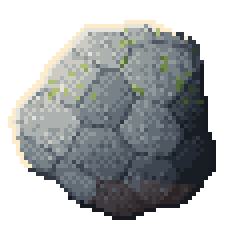
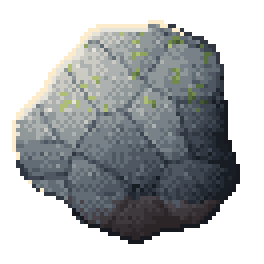
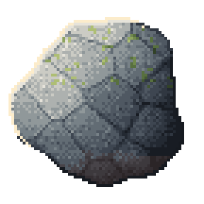
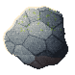
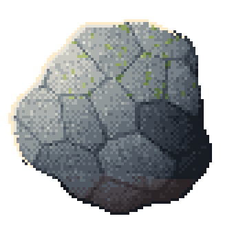
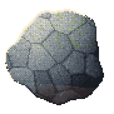
The rock grows with every push
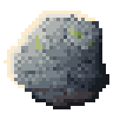
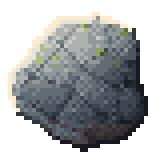
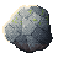
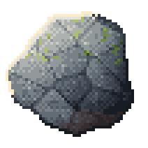
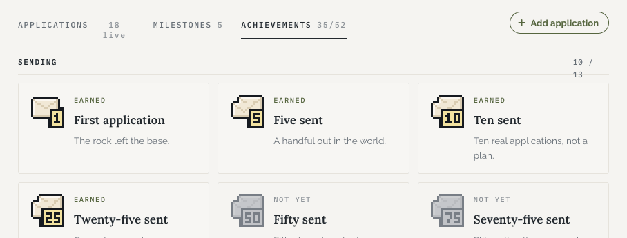
Sending an application moves the rock. Moving to a later stage pushes it higher. Rock levels, milestones and achievements all count things you actually did.
There are no daily quotas and no streaks to break. A job search is already stressful enough without a counter judging your week.
No reply isn’t automatically a no
An application that goes quiet stays where it is. It gets marked as quiet instead of failed. When a rejection does come, the rock rolls back to the next highest stage, and the copy says so plainly.
The humor is a little dark, on purpose. It admits the setback without pretending it doesn’t hurt.
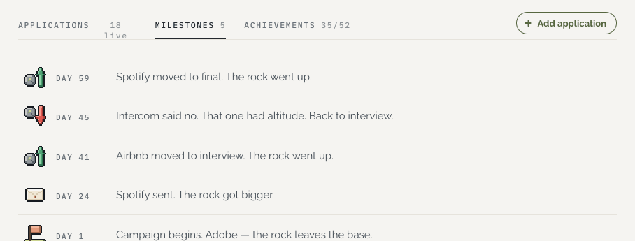
“Intercom said no. That one had altitude. Back to interview.”
A search is months, not moments
A campaign follows the whole search, measured by day. It holds every application, milestone, achievement and setback in one history.
An offer brings the rock to the summit. From there, you choose: accept, decline, or decide later. If you end without an offer, you can still keep climbing or close the campaign. Either way, the decision is yours.
Outcome & Reflection
What I built
Every step so far, planted like a flag on the way up.
Slope hasn’t yet shown that it improves mood, retention or job search success. That’s still to be tested.
What I learned
I started Slope thinking people needed a better way to find jobs. Early conversations challenged that. People already had ways to search. What caught their attention was the rock and the experience behind it.
That shifted my focus from helping people find more jobs to helping them recognize the effort they were already making. The biggest lesson was knowing when to let go of an idea and build around what actually resonated.
What’s next
The trail past this point is still unmapped. Five questions the closed beta needs to answer:

The Pivot
After an earlier game project didn’t work out, our team shifted direction while reusing parts of the existing technology and art assets.
The new concept started with dress-up and collecting fashion designers. But we still needed to understand what would keep players engaged beyond collecting.
Working closely with the producer, I explored new opportunities through competitor research, player interviews and early testing. These findings shaped the direction that became Episode: Reality Stars.
Understanding Players
We had a concept. We needed to know if players would care about it, and why.
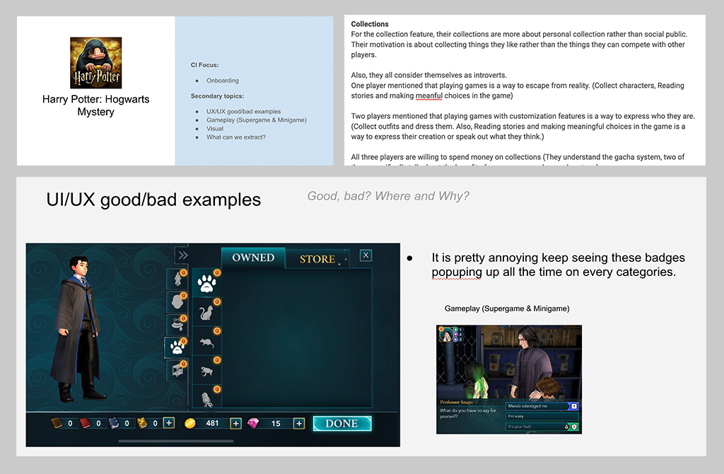
Competitor research
I played comparable games from Day 0 to Day 3 and documented their onboarding, monetization, UX patterns and what kept players coming back.
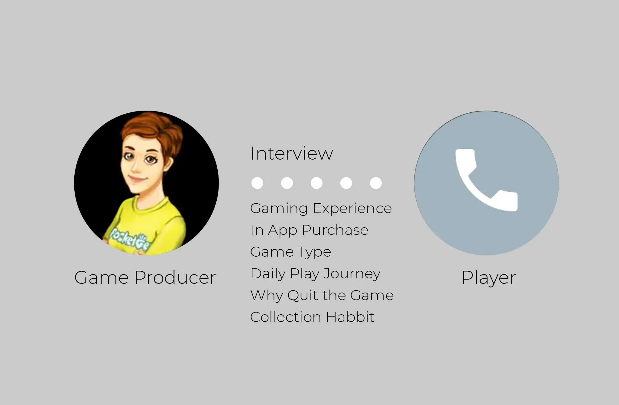
Player interviews
With the producer, I ran phone interviews with players who play and spend in Episode, to learn their habits and why they buy.
What we found
Collecting alone wasn’t the hook. Players wanted a story that reacts to them.
Turning Insights into Experience
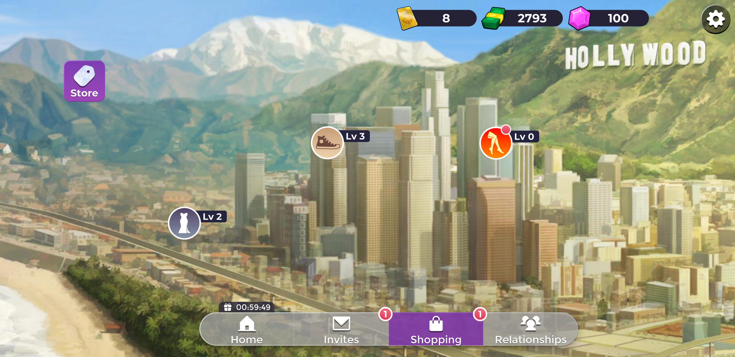
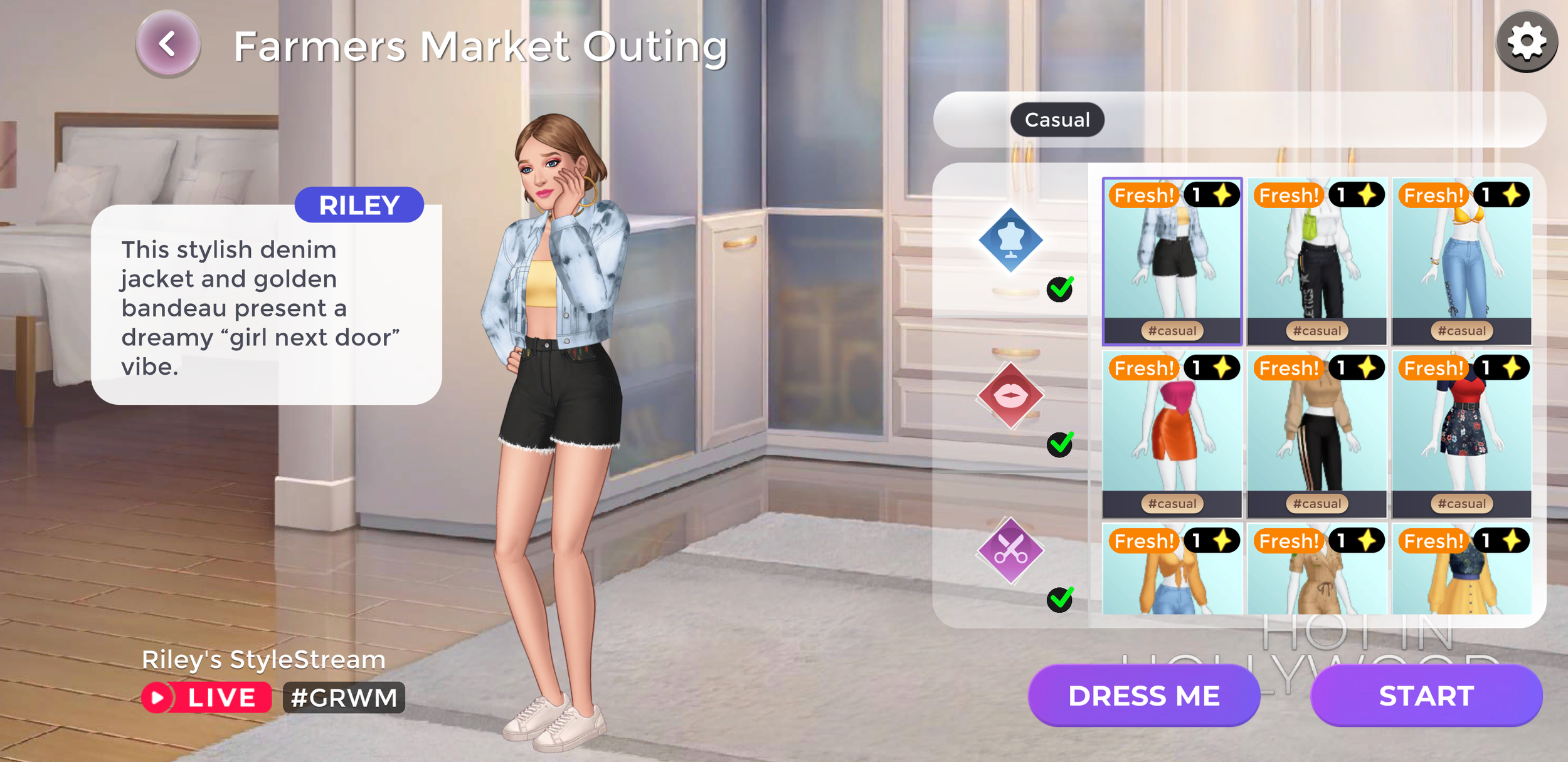
Each insight became one feature. Together they form the core loop of the game.
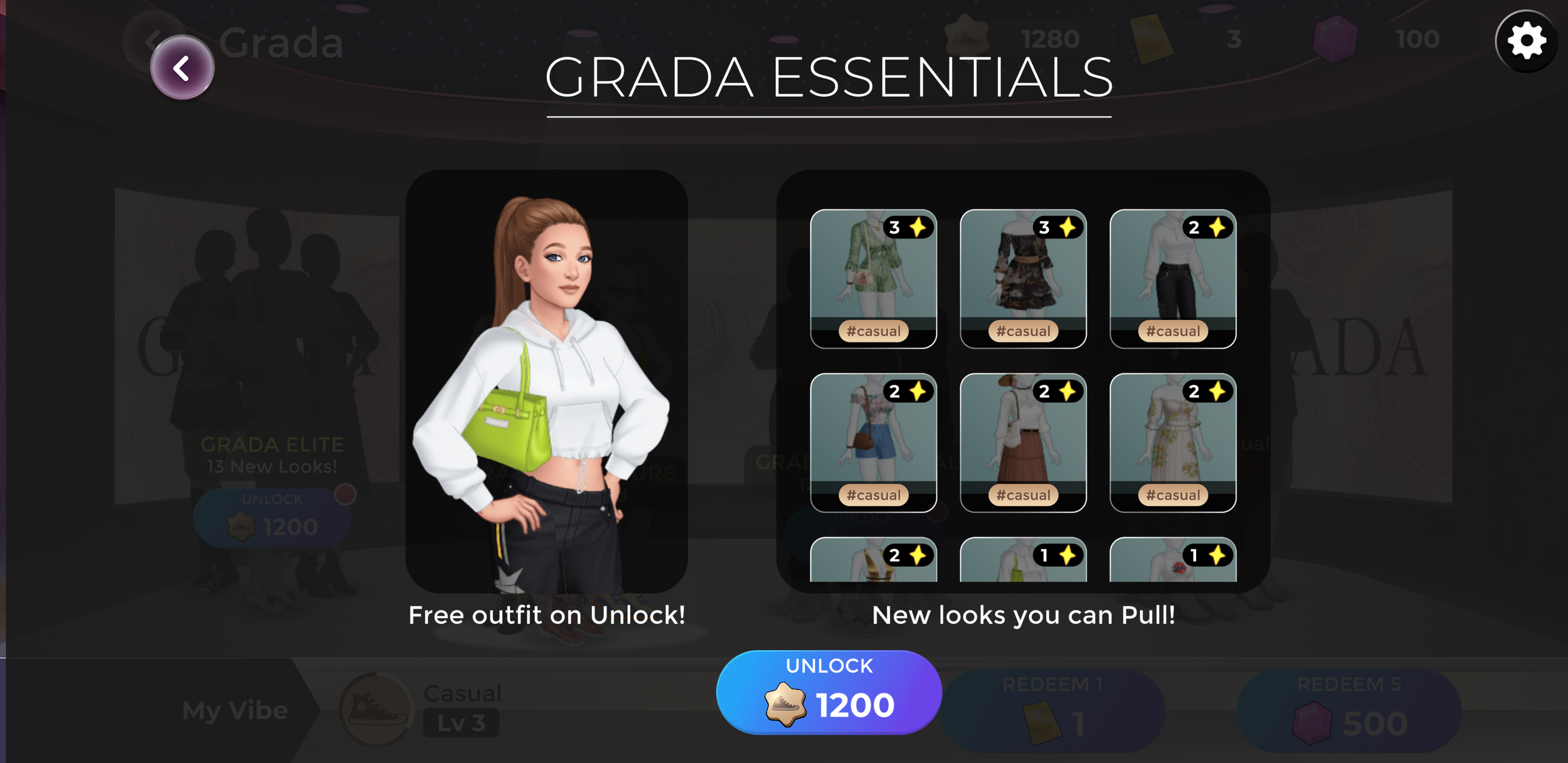
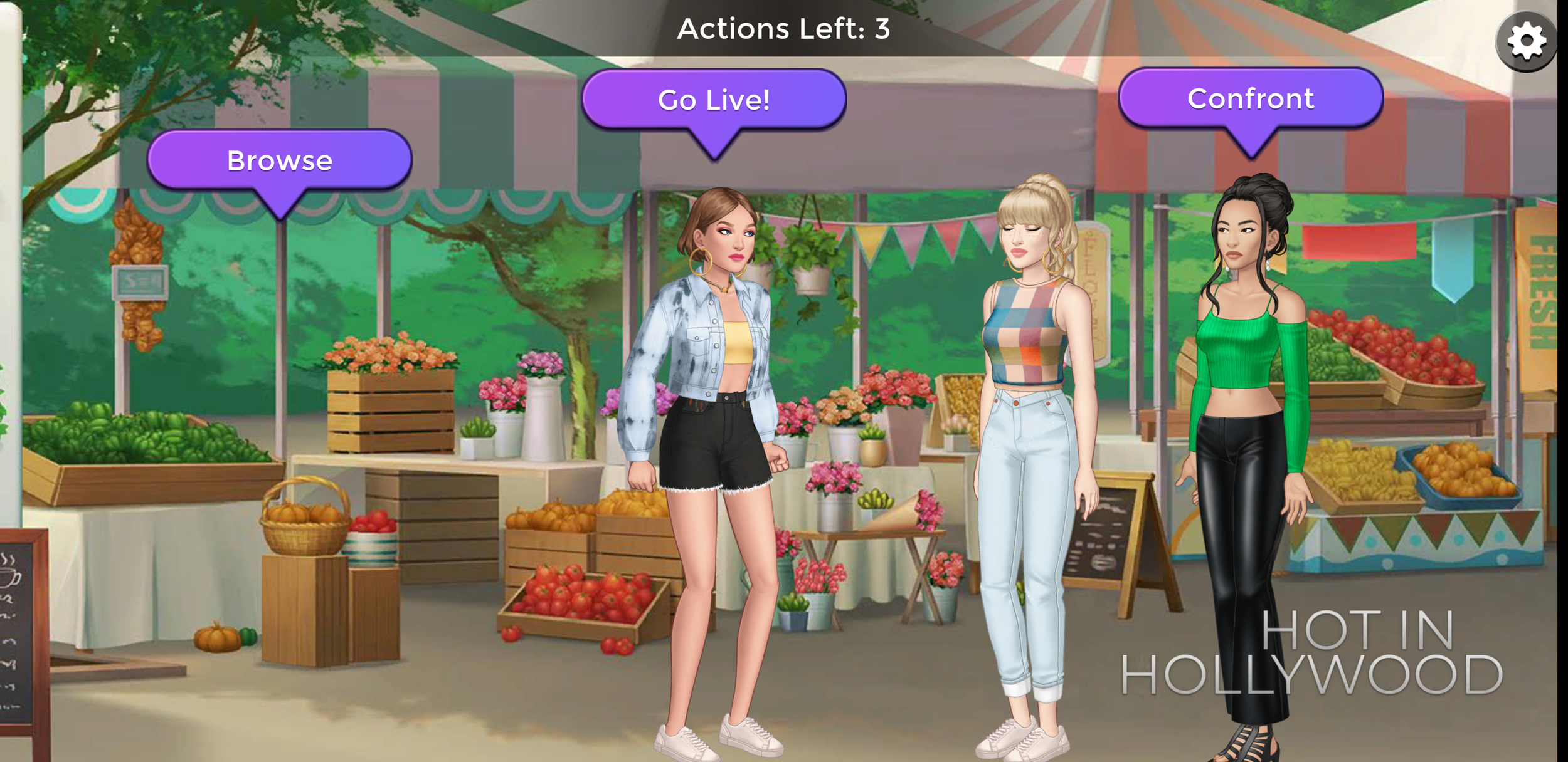
Testing & Learning
On usertesting.com, players tried the first 20 minutes of an early prototype. I wrote non-leading questions, watched them play and shared the findings with the team.
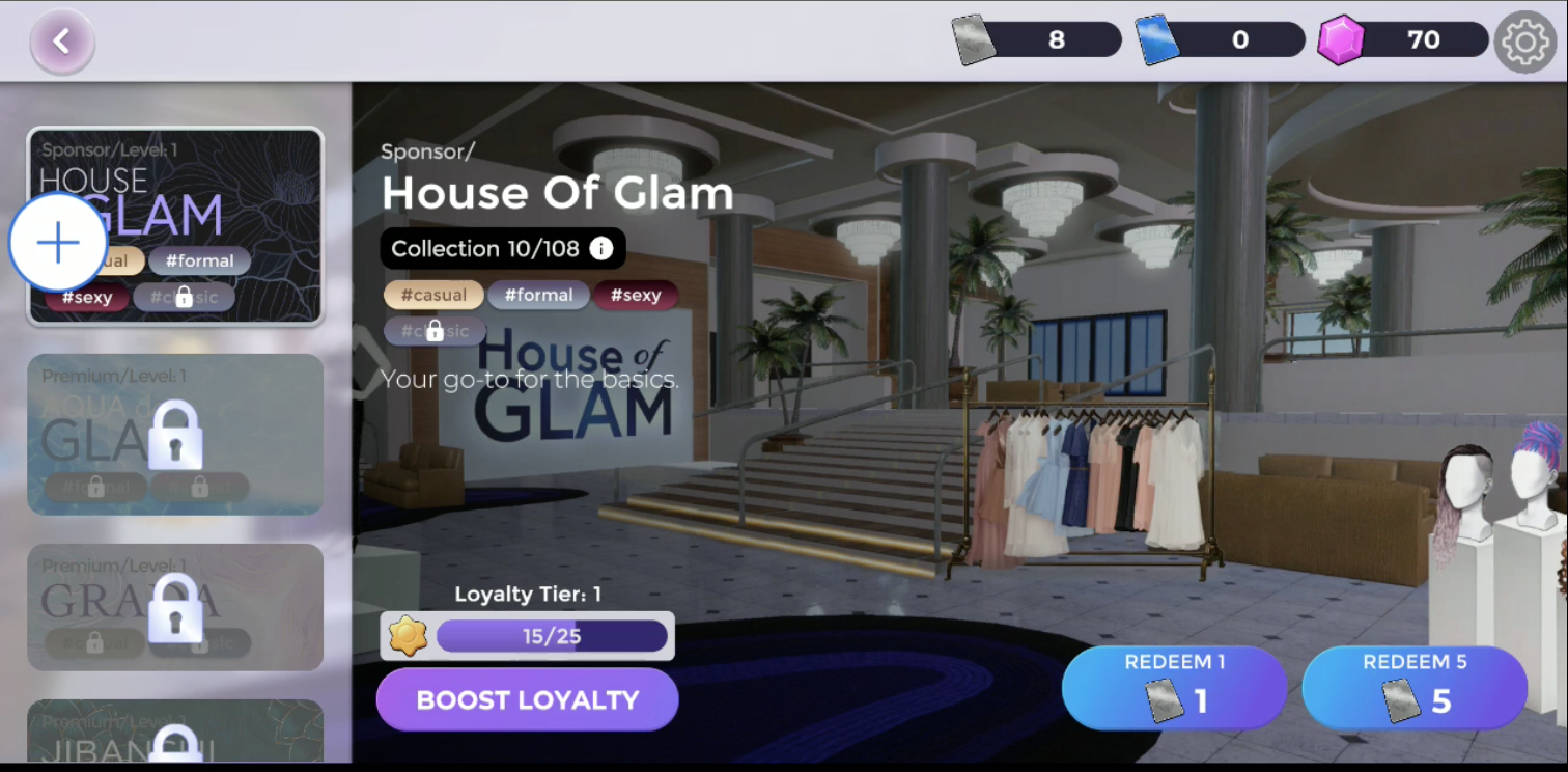
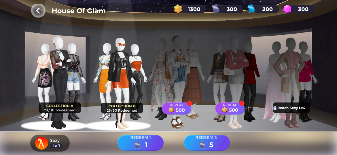
The key change: make the collection visible
Players loved picking outfits but didn’t feel they were building anything. I redesigned the brand screen to put the collection front and center, and simplified the content around it.
Outcome
Episode: Reality Stars launched publicly following multiple rounds of research, testing, and design iteration. The final experience showed improvements in Day-1 retention and early conversion during testing.
Top-chart performance
Peak rankings on the U.S. App Store.
What I Learned
A concept is just an assumption until players react to it. Research helped us find a direction. Testing challenged what we were most confident about: collecting.
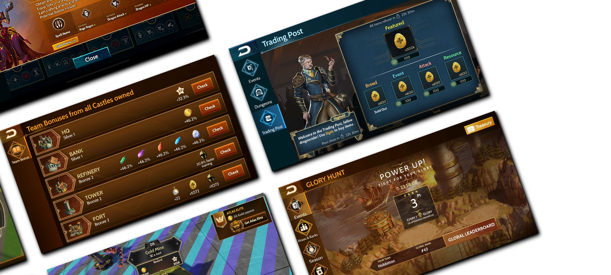
Overview
War Dragons is a 3D real-time strategy game. I designed its first Live Ops platform: an in-game web view that runs time-limited PvP events and seasons, and lets the team ship new content every week without an App Store release.
As Live Ops grew, so did the platform. Years later I came back to what I had built, looked at it with fresh eyes, and redesigned it so it could keep scaling.
The first release
A social PvP feature players would stick with, built in a web view so the team could ship new events every week.
Who it was for
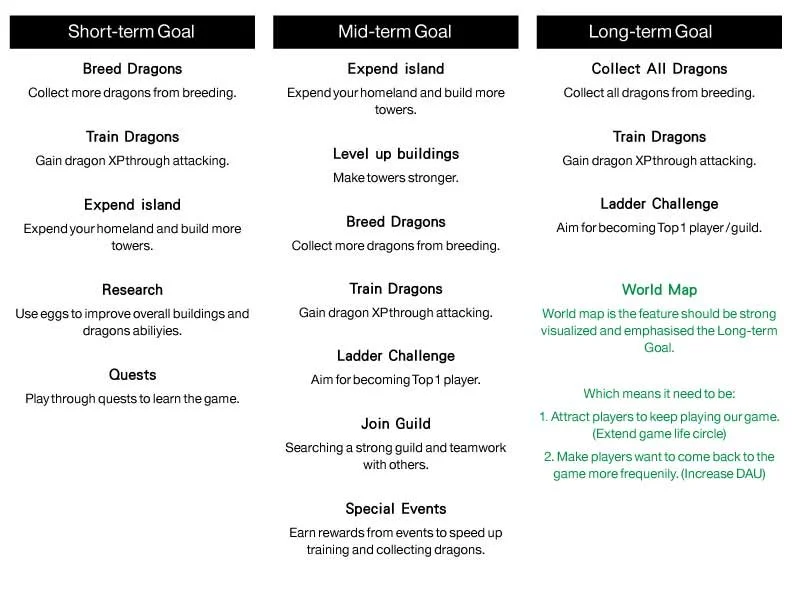
Our focus group showed two kinds of players.
GoalHelp general players grow into VIPs
How I worked
Every round of testing fed back into the design. This loop kept running long after launch.
From journey to wireframe
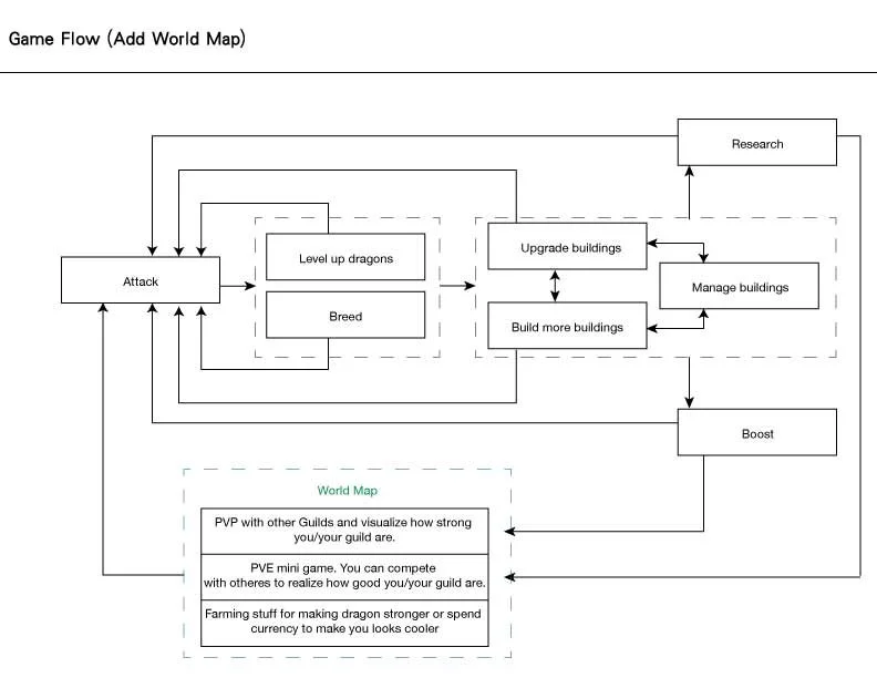
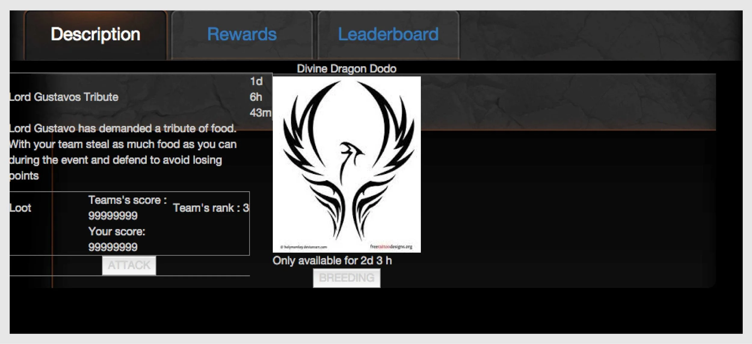
I mapped where the feature sat in the player journey, tested the web view with engineering, then explored layouts.
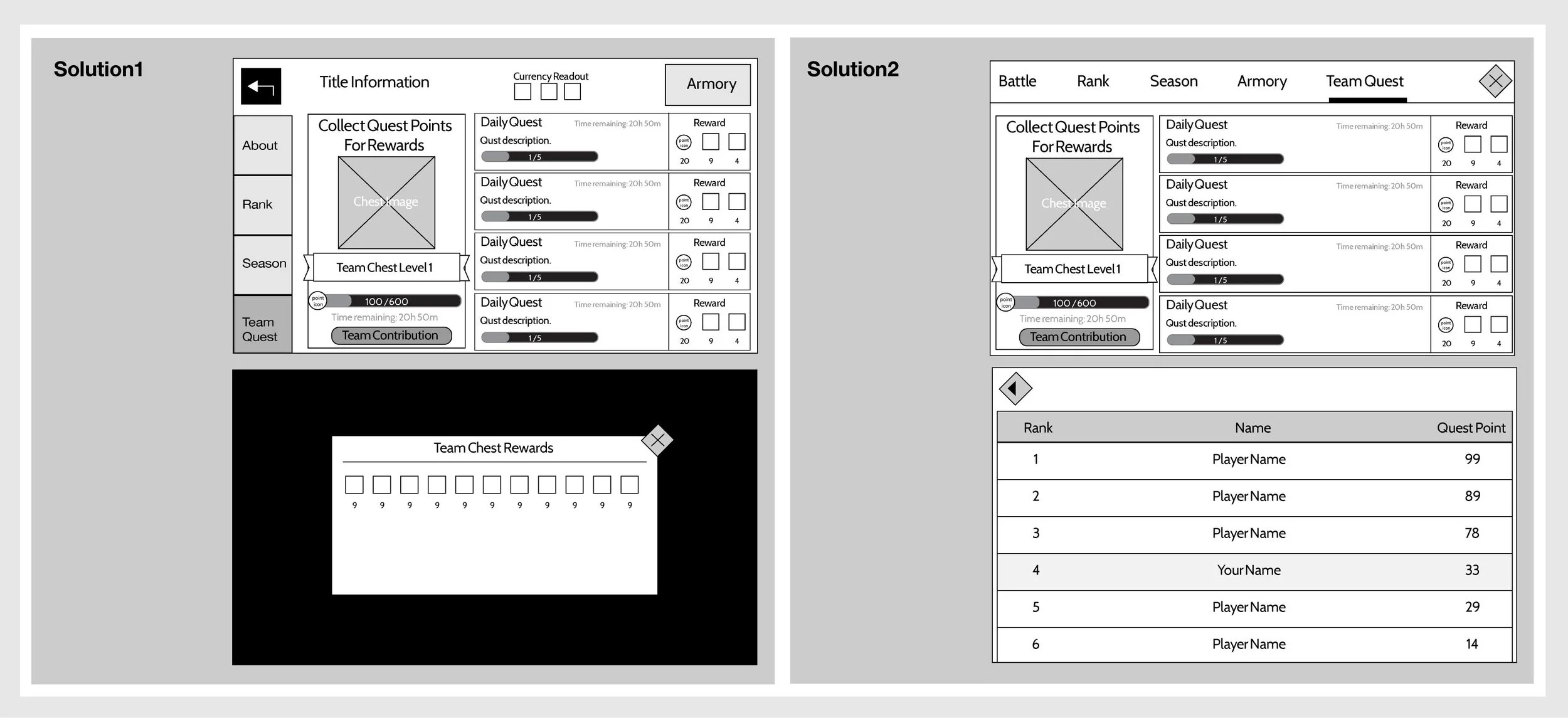
From one event to a season
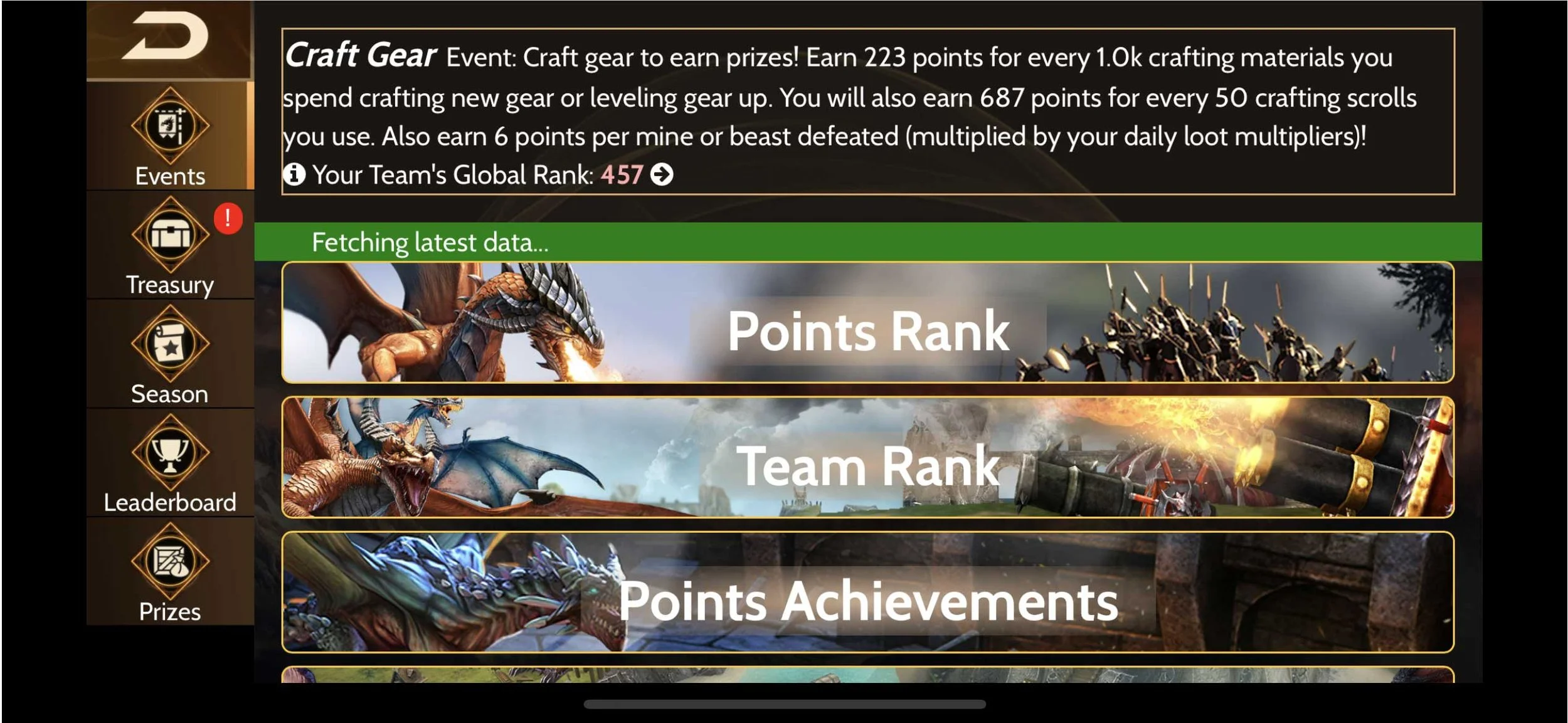
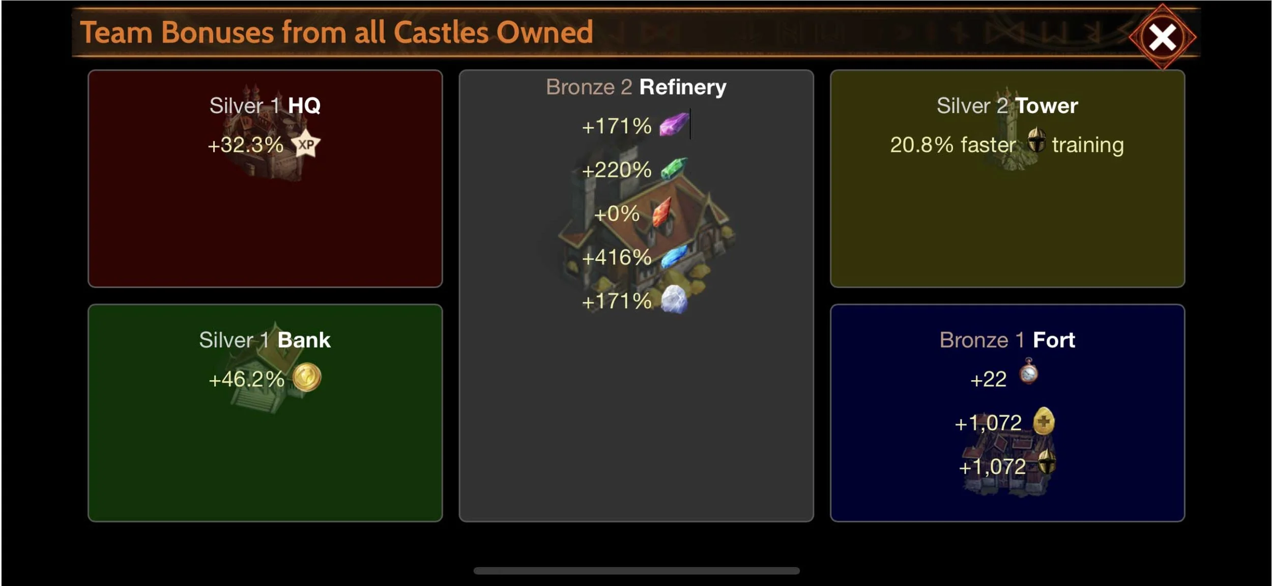
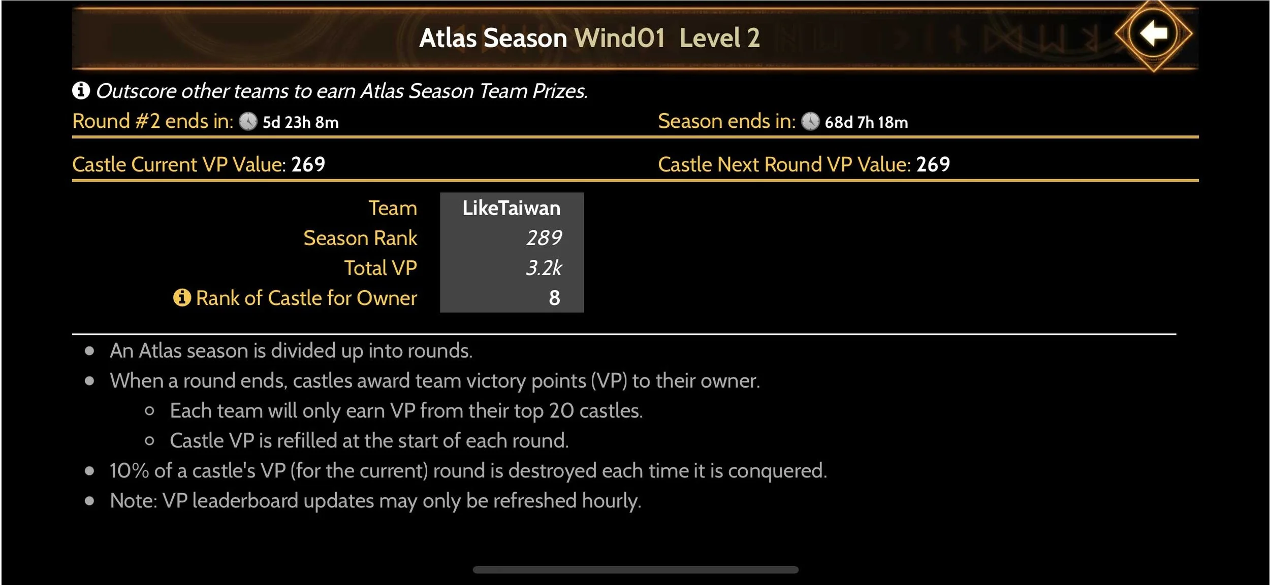
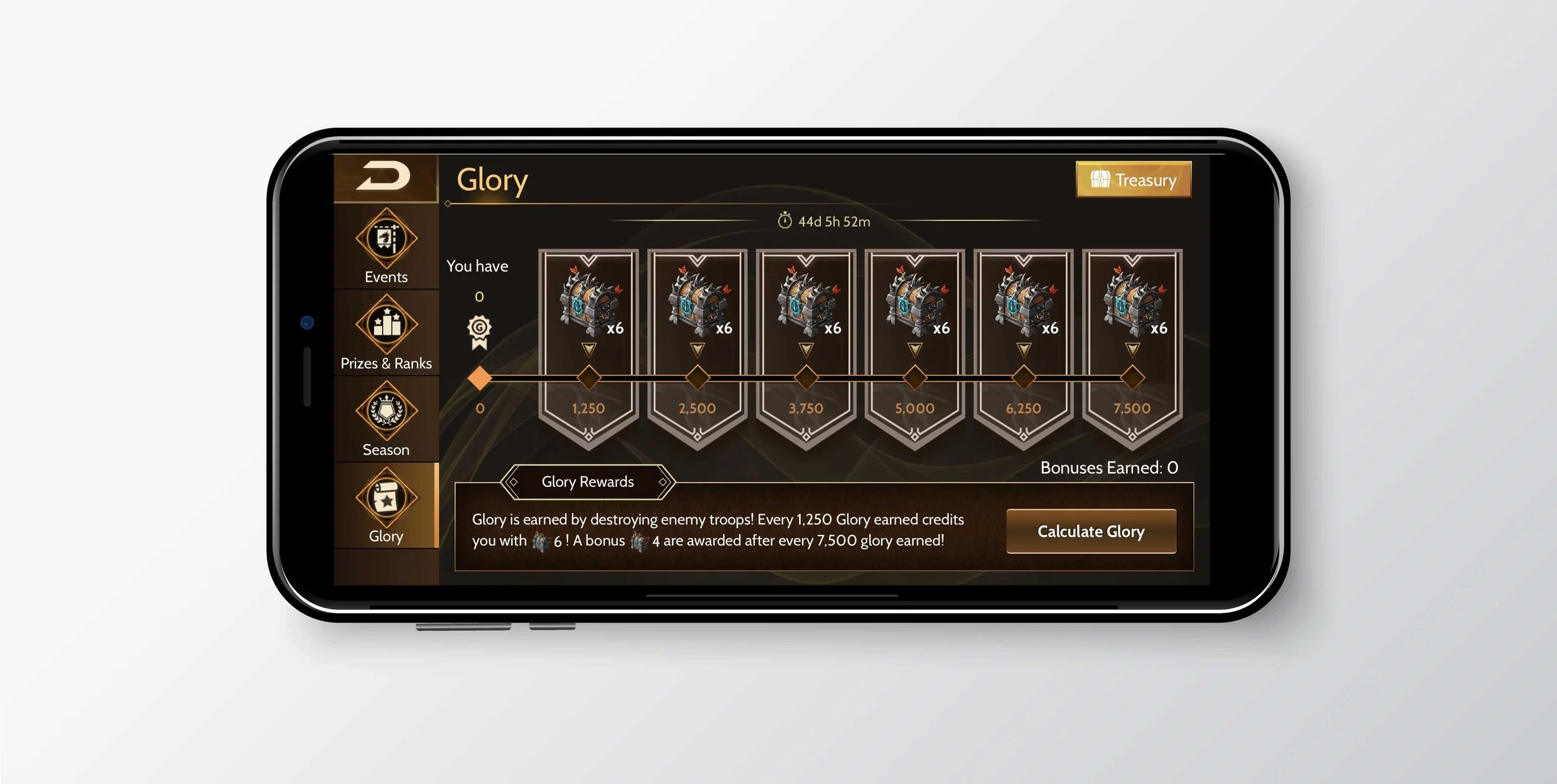
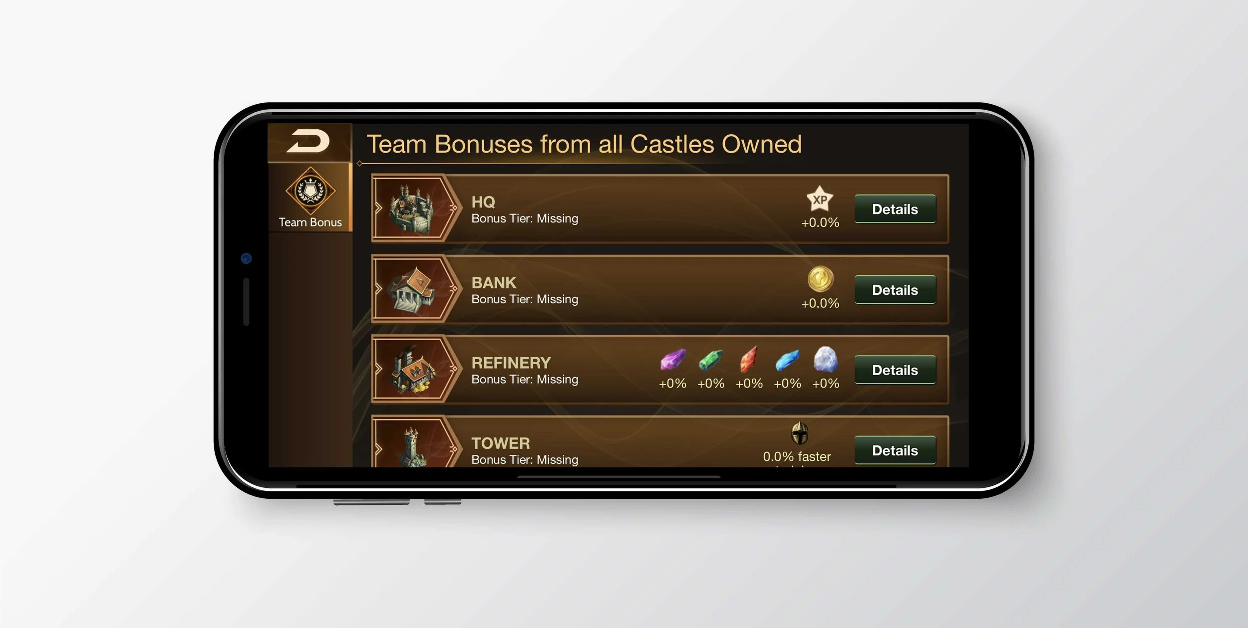
We launched with one PvP event and shipped a new one every two weeks. Once we had twenty, the six that worked best went into rotation while new events kept coming. Then we layered on leaderboards, team bonuses and finally seasons: one big event that wraps the six in rotation.
Growing complexity
As events piled up, Live Ops grew bigger and we kept testing new features. The platform got more complex, and players found it harder to understand events and new features. Our player experience team often had to explain them in the community.
How might we let Live Ops keep growing without the platform getting harder to use?
Redesigning for scale
I went back to my own design and rebuilt it around a few key decisions, each meant to hold up as more content arrives.
Design goals
Players were struggling to keep up, and every new event made it worse. The redesign had to make Live Ops easy to follow again, without slowing down how fast we could ship.
From goals to decisions
Each decision below serves one or more of these goals.
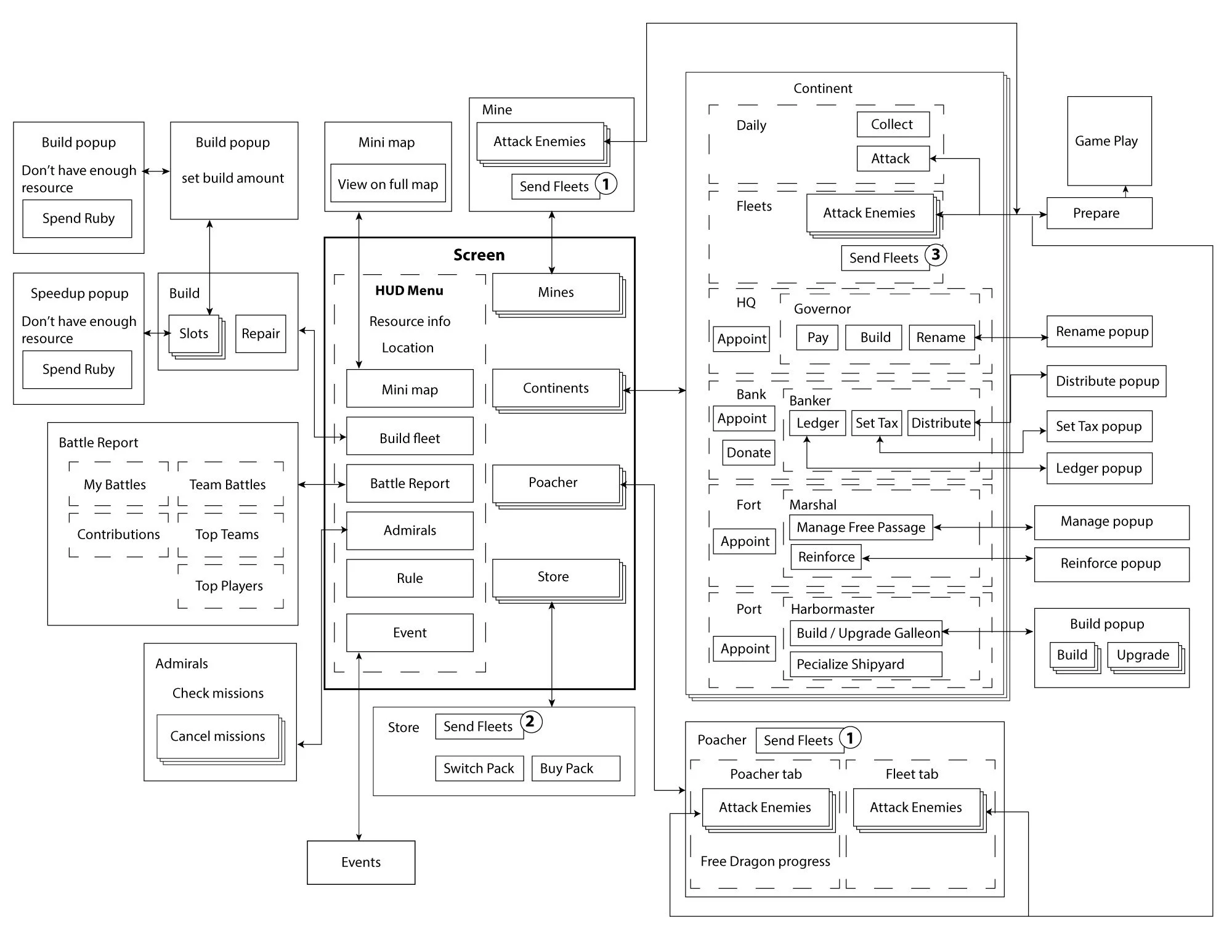
A structure that scales
I listed every function with the PM again and reorganized the information so new events slot into existing places.
Borrow what players already know
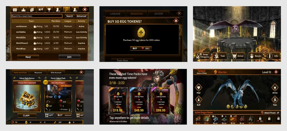
The web view adopted the main game’s navigation system. Players stop thinking about where they are, and complex screens get fewer mis-taps.
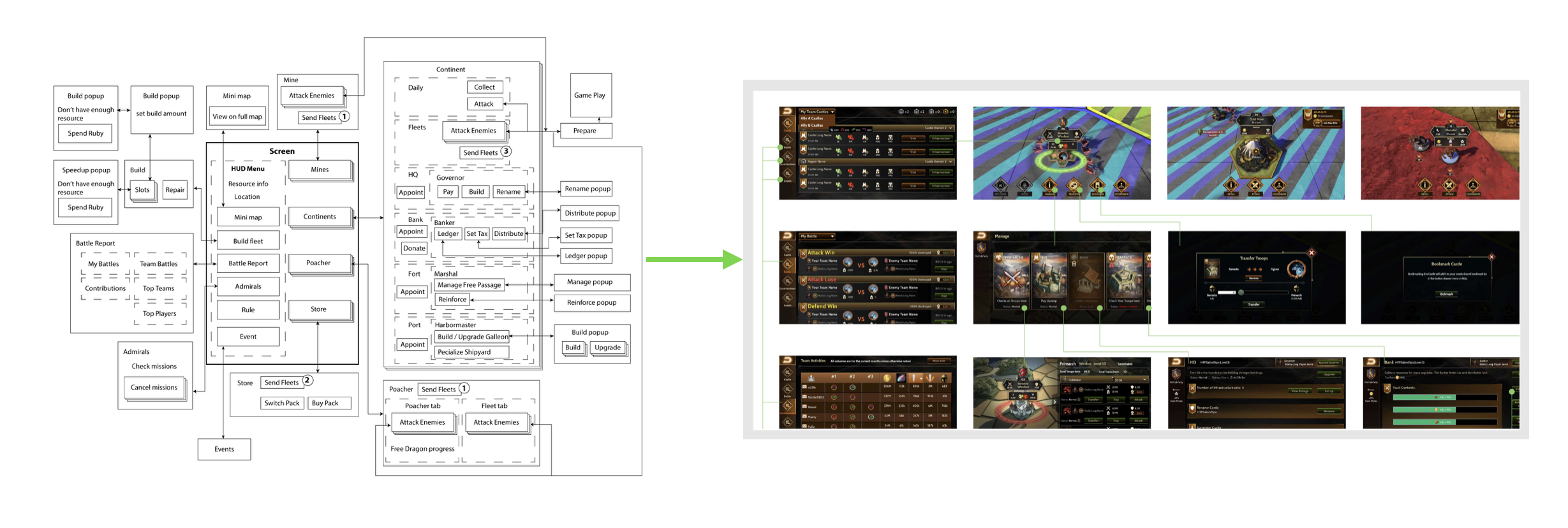
Make it one game again
With visual designers, I turned the wireframes into mockups that share the game’s visual language and repeat the same interaction patterns.
Check it with players
We previewed the redesign with the community, then invited VIP and active players to try it and tell us what they thought.
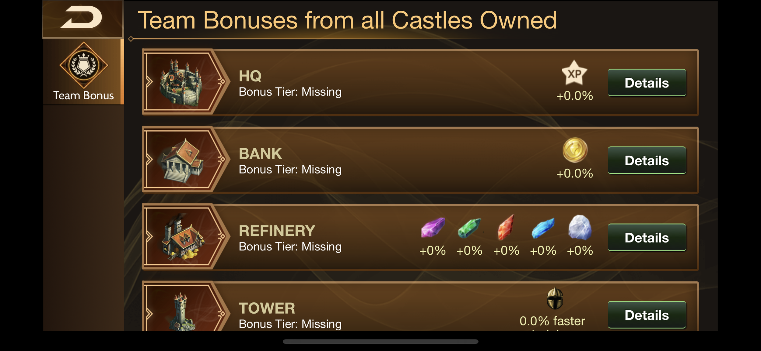
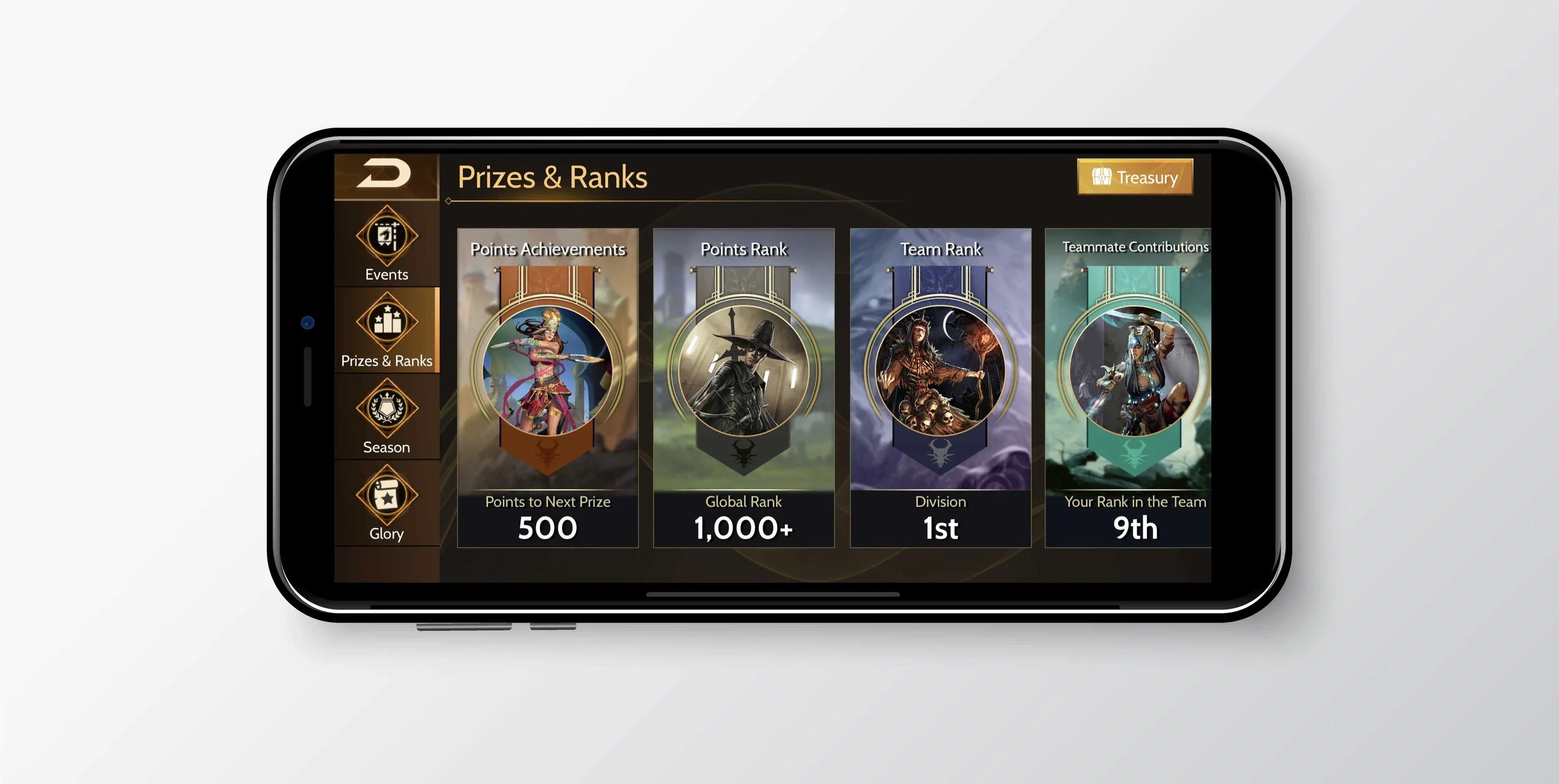
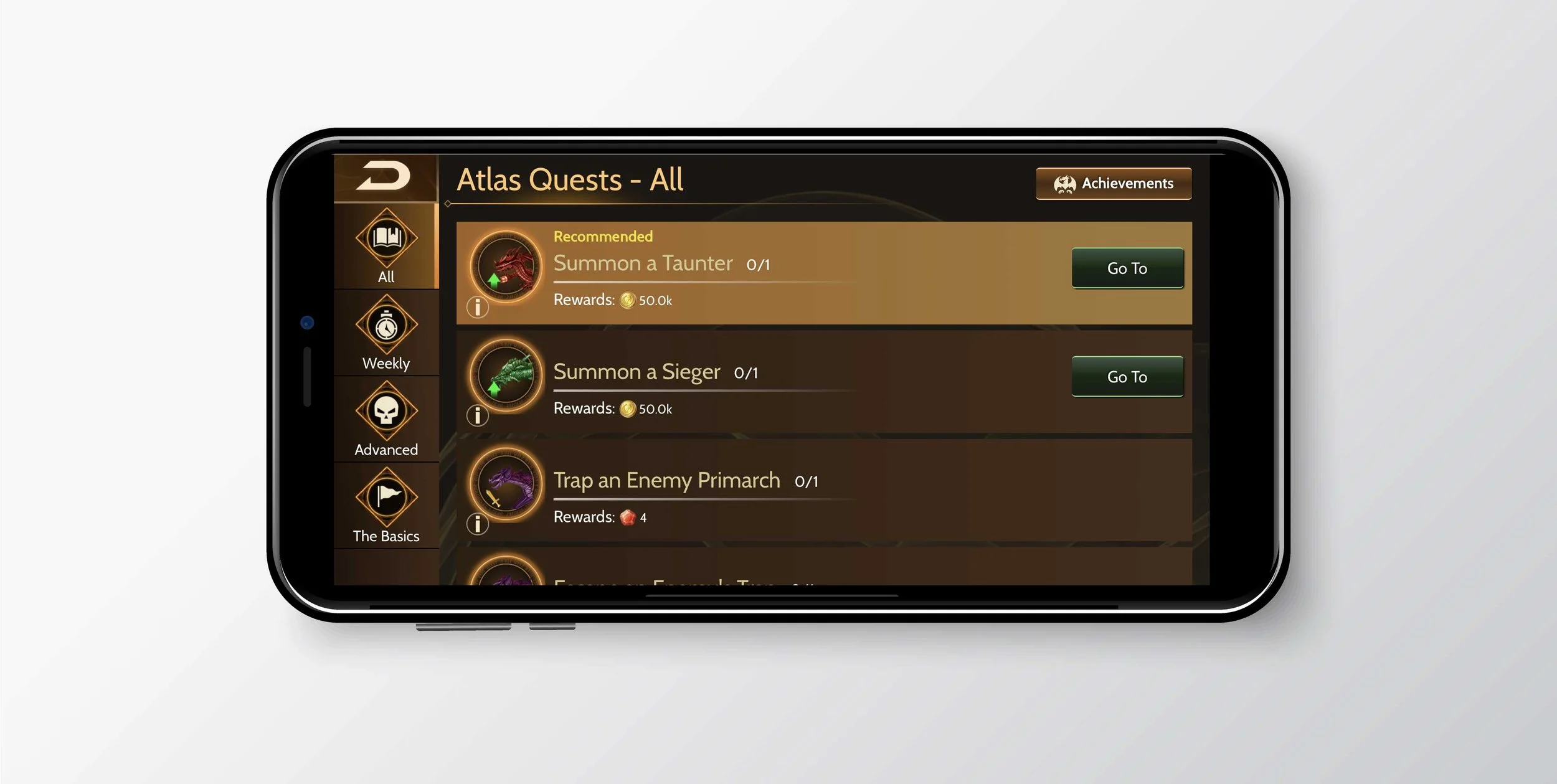
Final experience
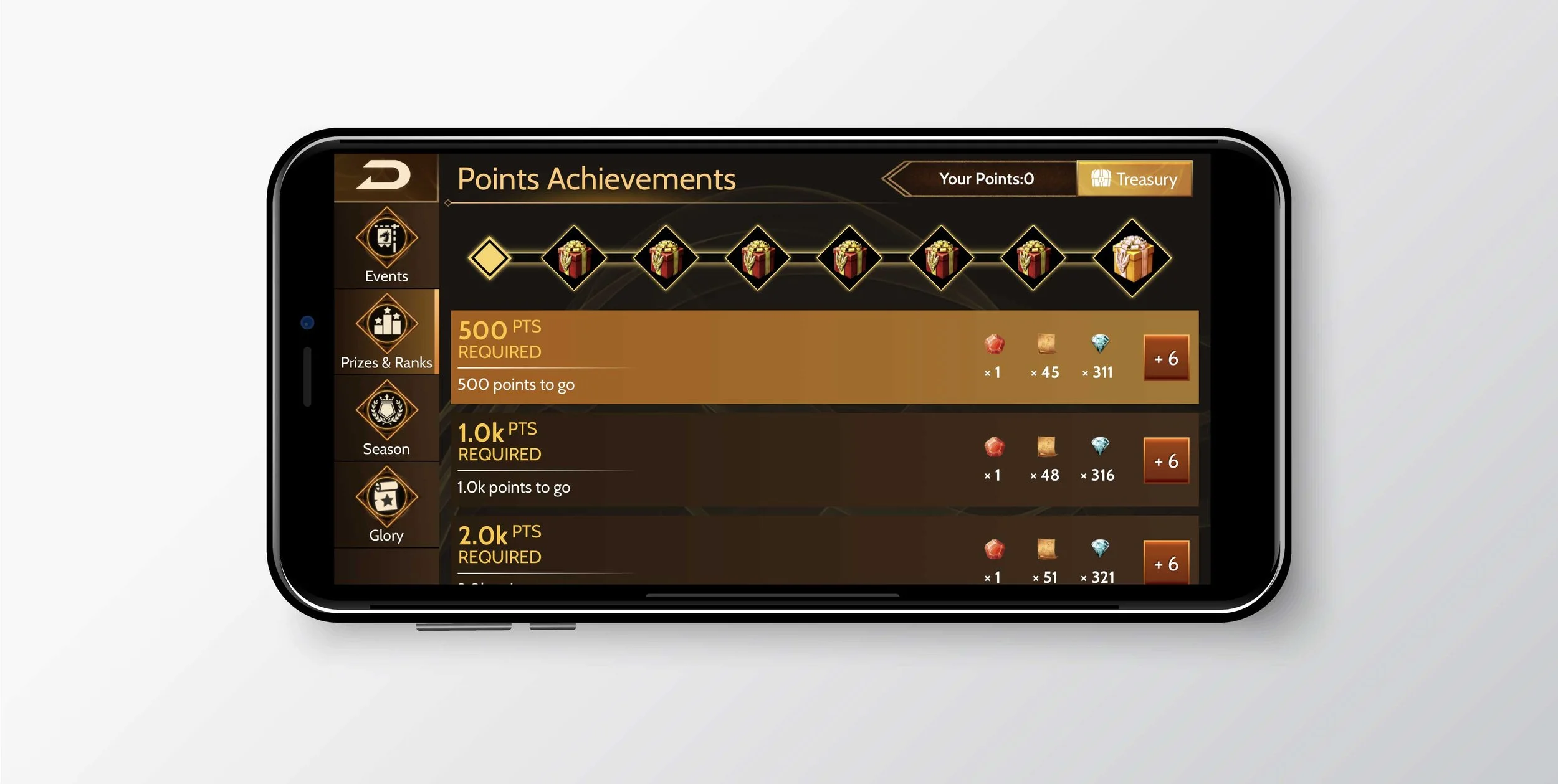
Same game, same navigation, clearer information.
Outcome & impact
Soon after the first release, Live Ops became War Dragons’ most important driver of revenue. The redesign made sure it could keep scaling up.
A platform that scales
The redesign turned a single feature into a foundation for ongoing Live Ops.
A top-grossing game
Live Ops kept the game competitive in one of the toughest categories on the App Store.
Players liked it
In the 2021 player survey, the community response was overwhelmingly positive.
Overview
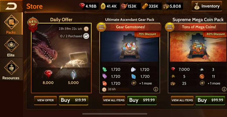
Two years after launch, War Dragons had grown feature by feature, team by team — but its navigation hadn't kept up. With more features on the roadmap, we set out to replace it with one consistent system that new players could learn once and use everywhere.
Problems
Working with the UX Director, I audited the existing UI and found three core problems.
How might we make War Dragons easier to learn, simpler to use, and consistent everywhere?
Goals
Each problem became a goal for the new system.
Research
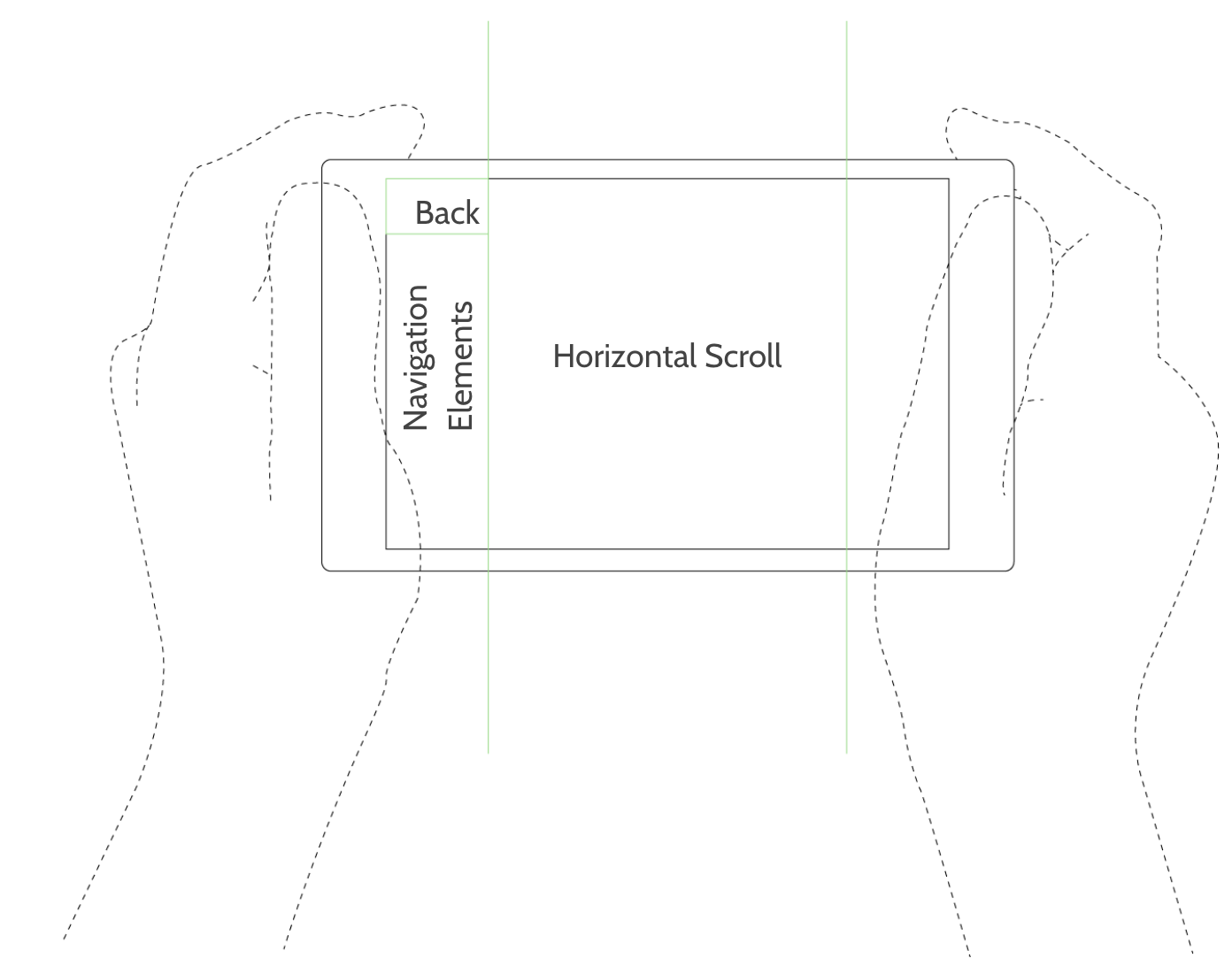
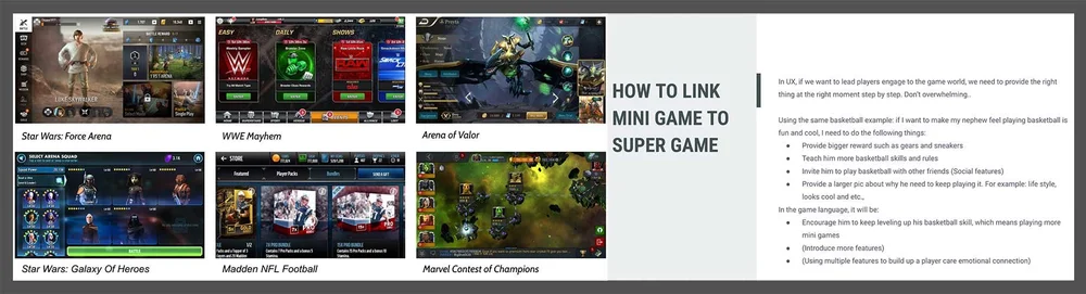
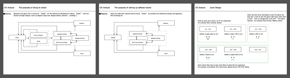
I studied popular games in other genres to see where mobile UI was heading and which patterns players already understood. Then I mapped our own flows to find where we fell short.
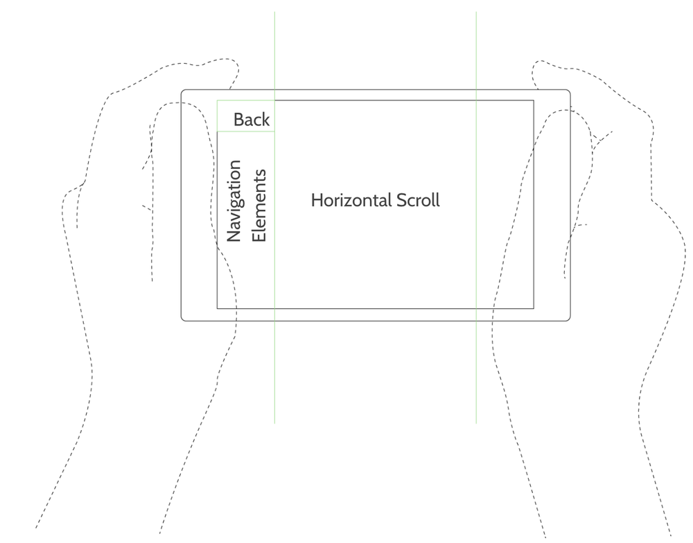
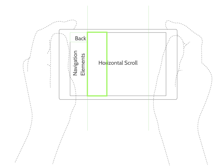
A navigation framework
One layout rule for every screen, so players always know where to look.
Iterations
The framework was tested on the Roster feature first, then refined with real players.
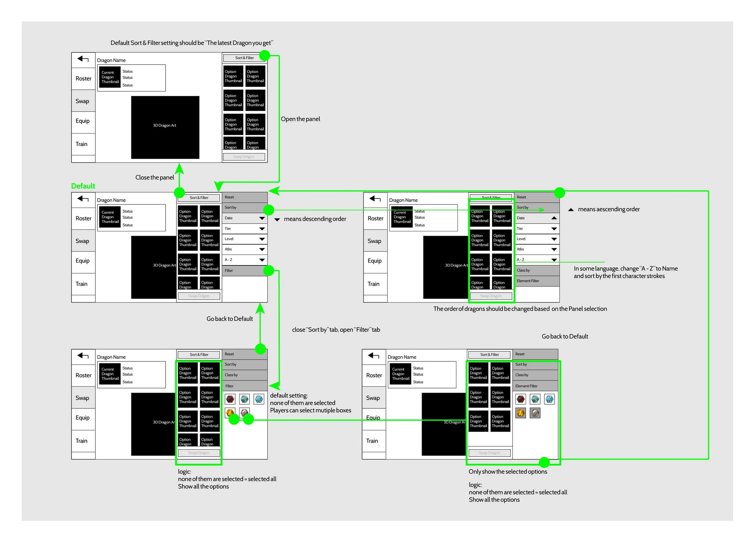
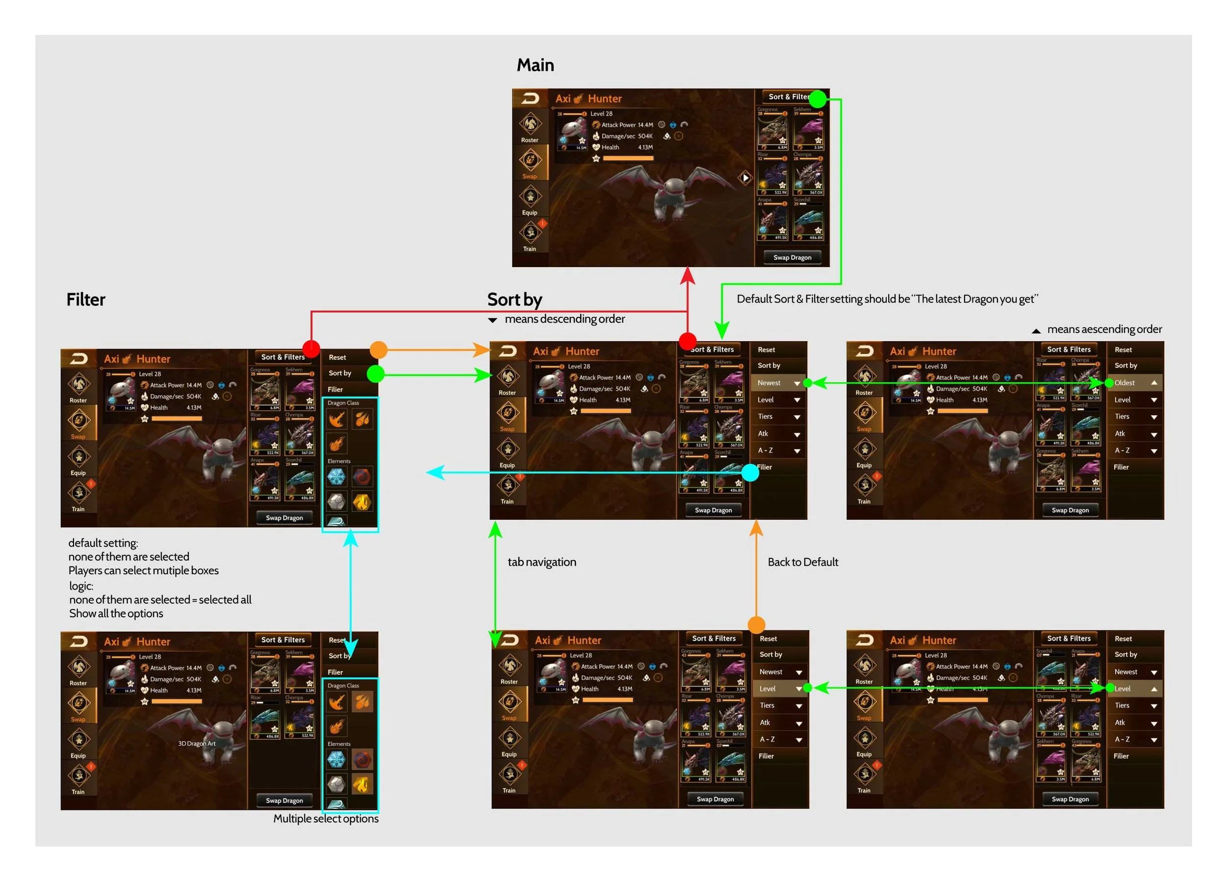
From layout to something testable
Concepts became basic layouts mapped against the full task flow. After an internal review, those wireframes turned into a clean hi-fi mockup and an interactive prototype for early tests.
Put it in players' hands
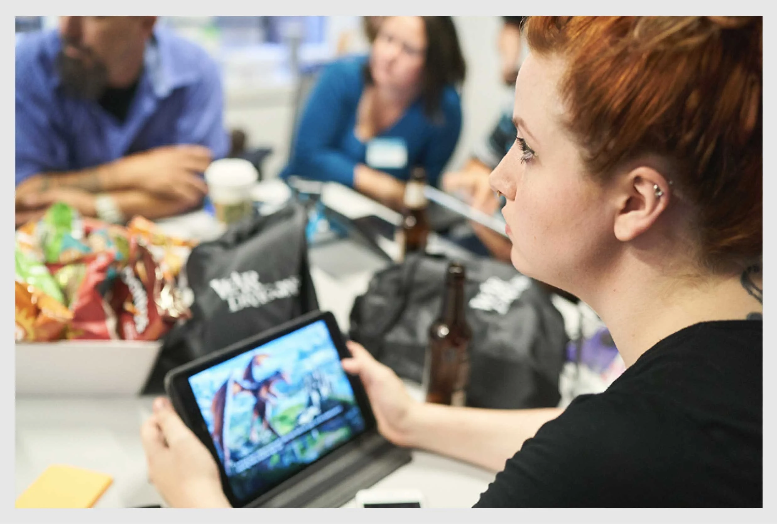
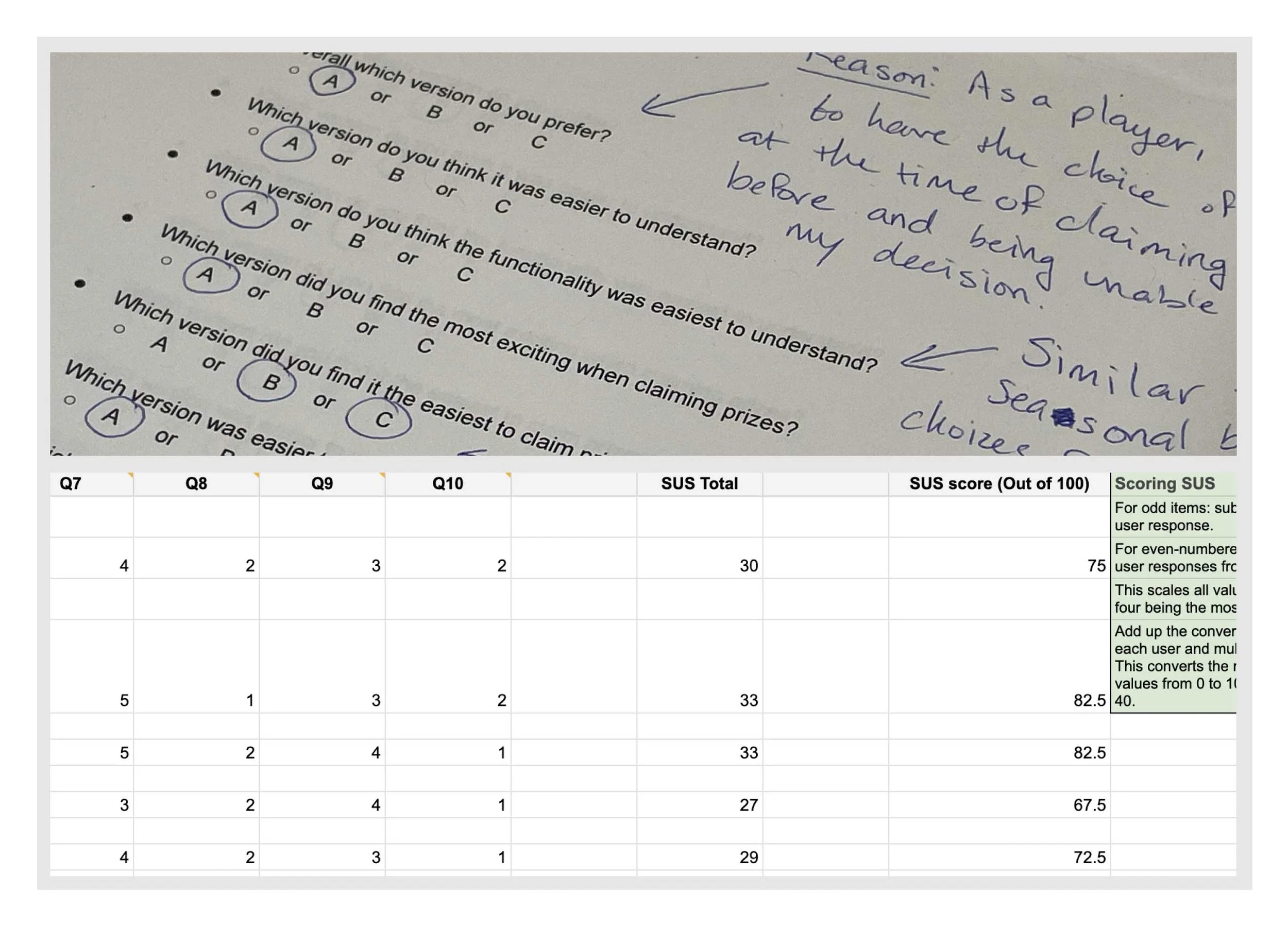
I ran on-site A/B tests with 10 players and scored each build with the System Usability Scale. VIP players also got a restricted build and told us honestly what worked and what didn't.
Repeat until it works
Feedback decided where we went next. Small changes went straight back into the prototype. Edge cases sent us back to the wireframes. We repeated this until players moved through the game without getting lost.
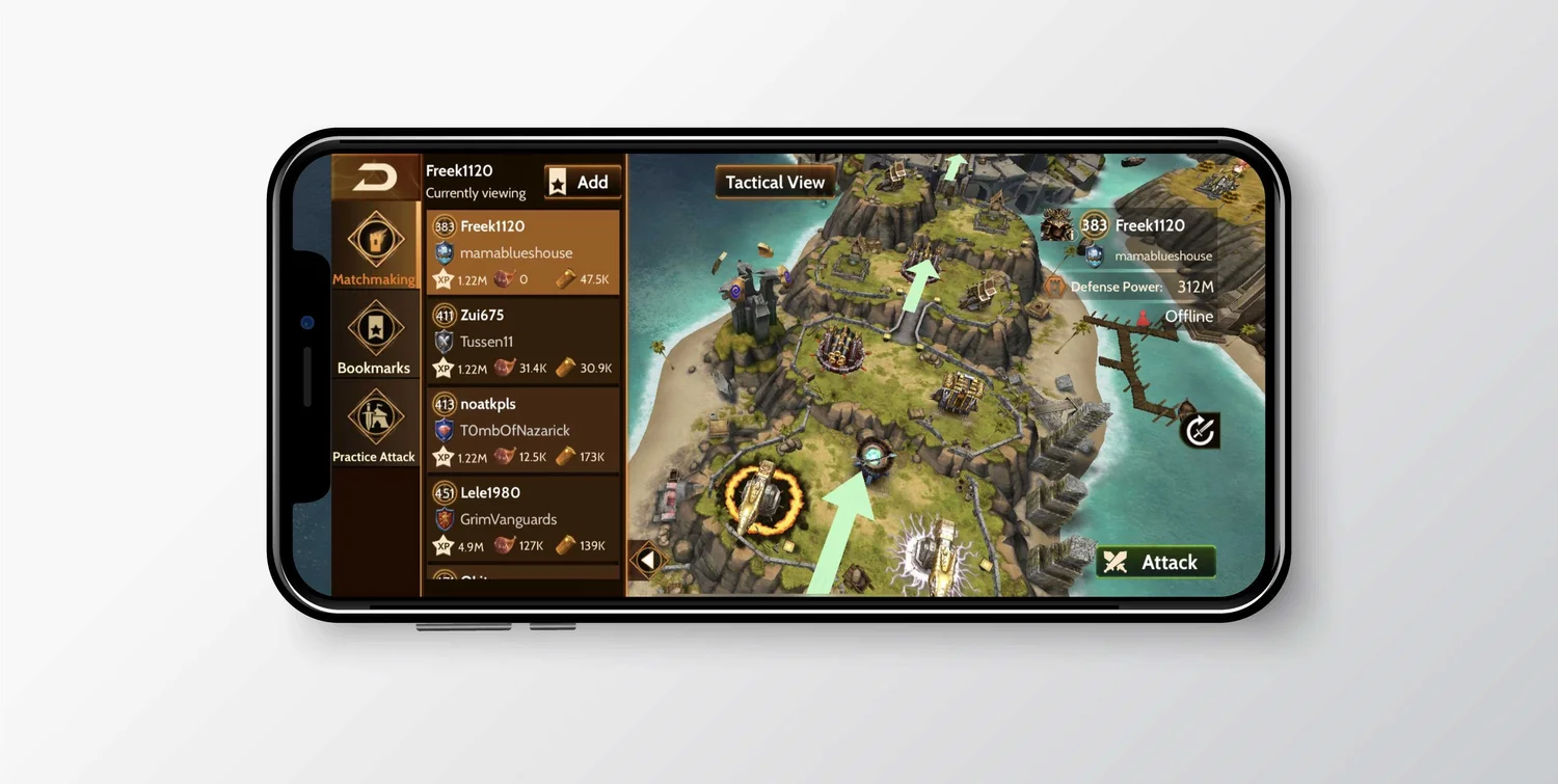
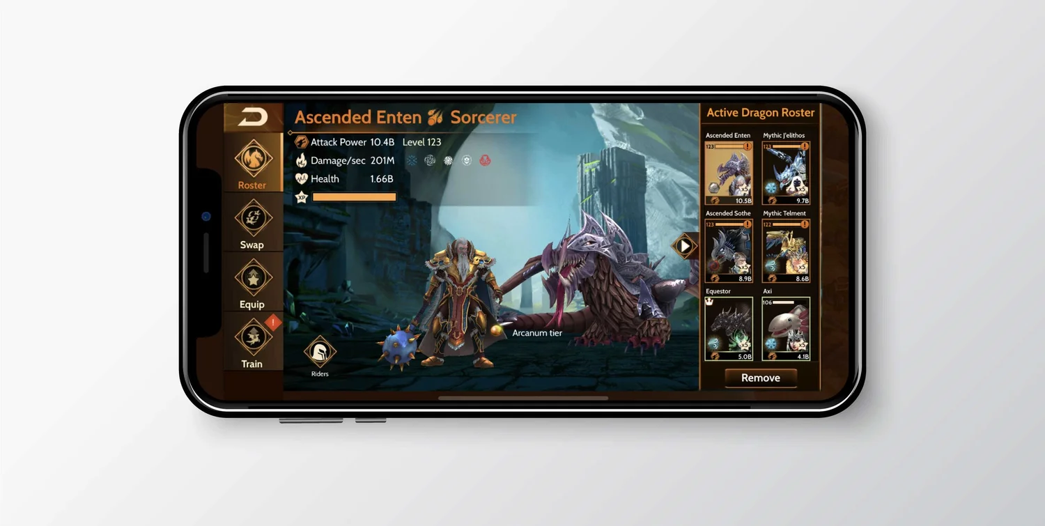
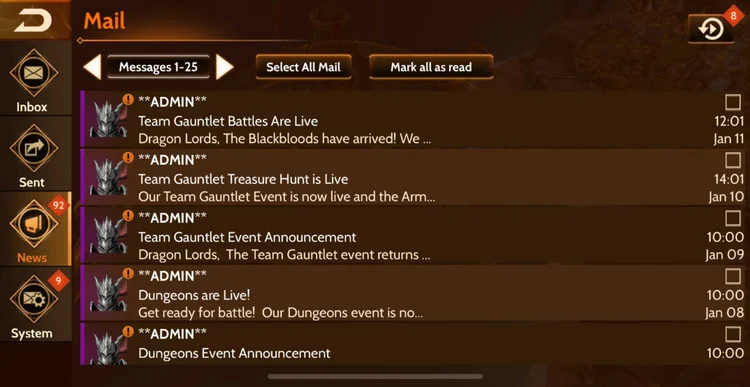
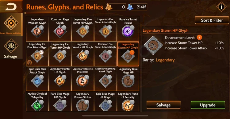
Final design
Results
The navigation redesign shipped to all players. Over the following months, the numbers moved in the right direction.
Players stayed longer, and spent more
Once getting around the game felt easier, players spent more time in it. Revenue per daily user followed.
Redrawn from the original analytics chart
More new players stuck around
A consistent layout meant less to relearn on every screen. Early player retention went up, which mattered most for long-term value.
Results presented publicly at GDC 2019
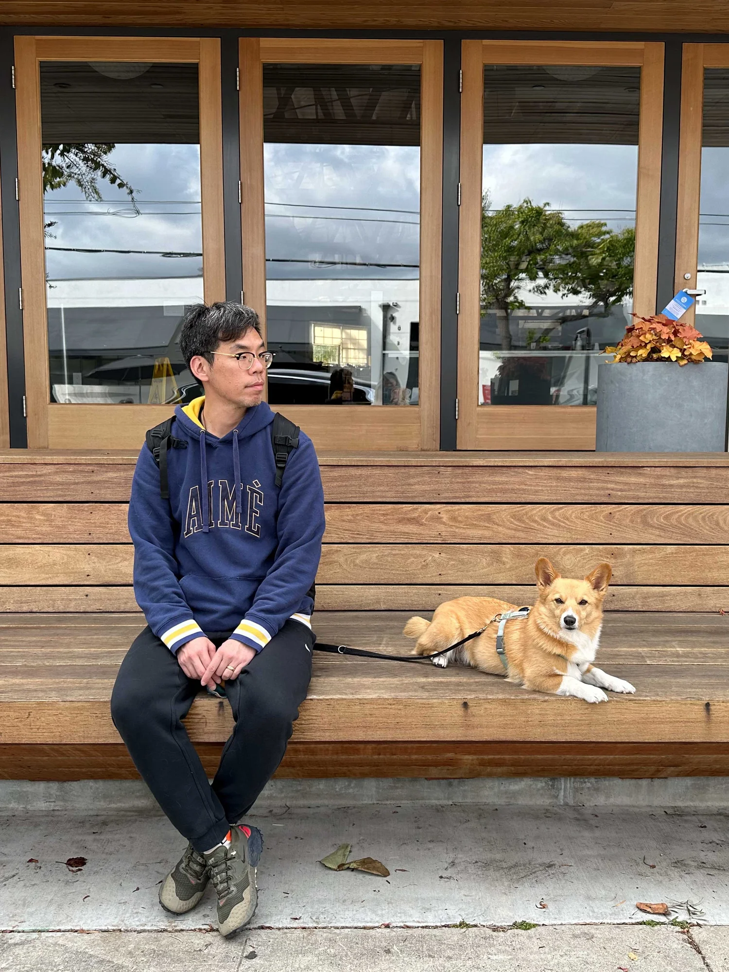
Hi, I'm Sean.
I'm a product and UX designer with 14+ years of experience across games and digital products, turning complex systems into intuitive and engaging experiences.
I've spent most of my career in fast-paced, collaborative environments where priorities shift and challenges rarely have clear answers. My background in gaming has shaped how I think about user motivation, engagement, and problem-solving.
My design philosophy is rooted in thoughtful problem-solving and strong craft. I believe great design comes from navigating the gray areas, making deliberate trade-offs, and finding the right balance between user needs, business goals, and technical constraints.
- Product & Systems
- Product Design, UX Strategy, Complex Systems, Design Systems
- Interaction & Prototyping
- Interaction Design, Rapid Prototyping, AI-assisted Design
- Visual Craft
- UI Design, Visual Design, Brand Identity